One of the things we’ve been contemplating lately is the color of our cornice. We thought we had a color picked out, but as I was half way done writing up this blog post I changed my mind. When I talked with Dan he agreed with me – that we should change our strategy.
It all started with me walking around Mount Morris Park taking pictures of townhouses for real estate clients – with the objective of understanding what was out there and possibly available. I looked at the cornice colors and my favorite color was gray – it just makes for an incredibly handsome cornice. Here’s the gray cornice from 30 West 120 which sold recently for $2.5M…
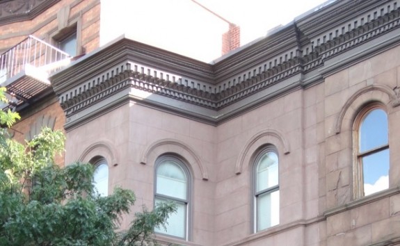 To my eye that’s a bit of a brownish gray. There are also some handsome gray cornices at the other end of our block – 102 and 104 West 123rd both have gray cornices…
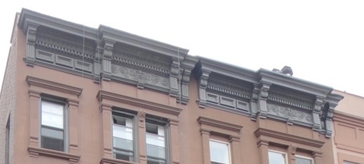 As you can see 102 (on the left) has more of a taupey gray and 104 has more of a bluish gray. Personally I don’t really like the bluish gray so much. I like a taupey or brownish gray..
What we’re worried about when it comes to using gray is that our façade will have too many different colors. Our windows will be a chocolate color, our stoop railings and the grill work on basement level will be black – gray wasn’t really a color we were going to have anywhere else except the cornice, so it didn’t really make sense. The places we liked that used gray used it elsewhere on the building.
The chocolate is sort of tone-on-tone with the brownstone façade. We could have gone with a chocolate cornice… Those look good too…
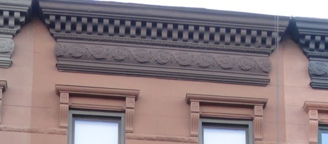 But the color we’ve decided to go with is black…
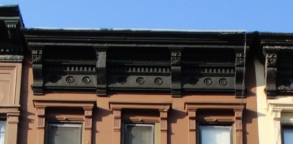 That means our building’s hat (cornice) will match it’s shoes (stoop railings and basement grill work) while the windows and basement doors will just blend in with the brownstone. The only down side is that it will be a pretty somber/formal color combination.
The one remaining question is the color of the front parlor doors. Dan’s advocating for chocolate colored doors with the logic that all the wood on the façade should be the same color. I could see that, but I could also see black since that the façade’s accent color is black and the parlor door is a focal point of the façade. We’ve got some time before we have to make that decision. I’m guessing we’ll go with chocolate – it will soften the look and make the façade seem less formal.
I agree with the black – as I was reading the post and scrolling down, I kept thinking “black!” “black!”. Great choice. And I kinda think the parlour doors should also be black, but I’d have to see a picture. And what colour is the front door, or is it natural wood?
Doug – The doors on the basement level will be chocolate (like the window frames), but behind grill work that’s black. The exterior parlor doors are the question. The interior parlor doors will be chocolate. But they can be different – since the exterior doors will be rehabbed historic doors and the interior doors will be new, modern with just a nod to the old-style paneling, etc.
So on further investigation… Benjamin Moore has this color (Deep Bronze) that’s such a dark brown it reads as black except in bright light when it looks a bit brown – it’s one of their standard colors for painting metal… Dan and I like the idea and think we’ll get a sample of it to try out. True black can be a bit severe and this will be a softer version of black…