A while back we discovered Eggersmann at the A&D building and really liked them. In fact we liked them better than Poliform which is saying a lot – our last kitchen was by Poliform and Poliform’s sense of design resonates with us, but Eggersman is even better (in our opinion). When we first talked to them, Eggersmann was nice enough to mock up a kitchen for our space and quote us a price, but the price didn’t really work with our budget.
Well, months passed and then someone at Eggersmann found my previous blog post mentioning them. They contacted us and asked if we had made a choice yet. Thanks to problems with DOB, we hadn’t. They noticed that I had mentioned that their last price was too high, and offered to design a lower cost kitchen. Our kitchen design and layout had changed somewhat since their last proposal. The biggest change was moving the coat closet further into the building – across from the stairs rather than across from the kitchen. The other change was getting rid of the upper cabinets and taking the cabinets at each end to the ceiling (which is 10.5′ tall). The net result was a 1/3rd savings in cost. We need to see where the other numbers come in, but we’re thinking we just might be able to afford an Eggersmann kitchen, which is quite exciting…
Dan and I had gone through several rounds of kitchen designs but hadn’t been 100% happy with anything we came up with. Many of the designs reminded us of our last kitchen and we really wanted this one to be different. Finally I proposed a layout one day and Dan liked it. That’s the layout Eggersmann laid out (and improved slightly). Here are some 3D renderings Eggersmann did for us…
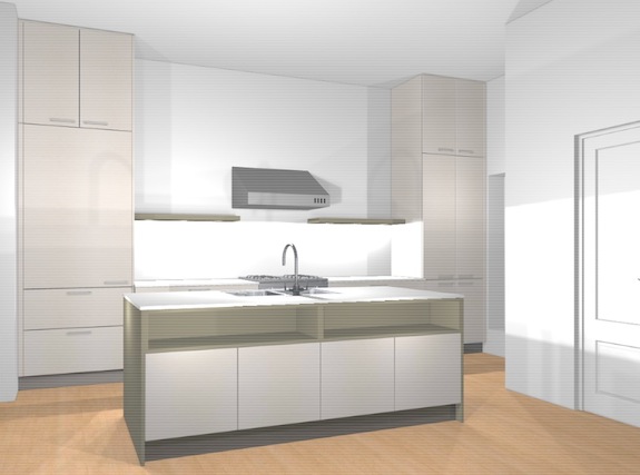
Instead of having coat closets across from the kitchen, we’re going to have a bench where people can sit and talk. This will essentially be the view from the bench. The door to the right is the front door. The upper panels in that door will be glass. The column to the left will house a Sub Zero 736 TCI fridge. At over $6,000 it’s our one huge extravagance in the kitchen, but we loved the 700 TCI we had in our last kitchen… The shelves in the center island will be used for wine and cookbooks. Dog leashes and the like will go in the cabinets below.
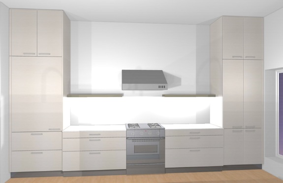
This shows a few of the details more clearly. We’re envisioning Corian (white) counter tops, a stainless back splash. The range is a compromise. We’re going with a 30″ Electrolux when Dan would really love a 36″ Wolf, but it costs nearly $4,000 more. The range hood was one of our challenges. The shape of it will probably be a bit different than what you see, but luckily we can exhaust directly out the wall, so no chimney is needed. We’re also thinking of put lighting on the top of the shelf as well as the bottom so the wall isn’t so dark.
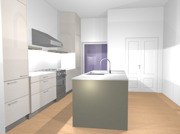
Seen from a different perspective… The wall to the right will be exposed brick, and the front doors will have glass in the top panels. The window looks huge as it is, but looking at it now I realize it wasn’t drawn big enough. It’s 4 feet wide, 7 1/2 feet tall, so it will be another foot higher (at least). It won’t be one huge piece of glass. Instead it will look a bit like a french door (two vertical casement windows).
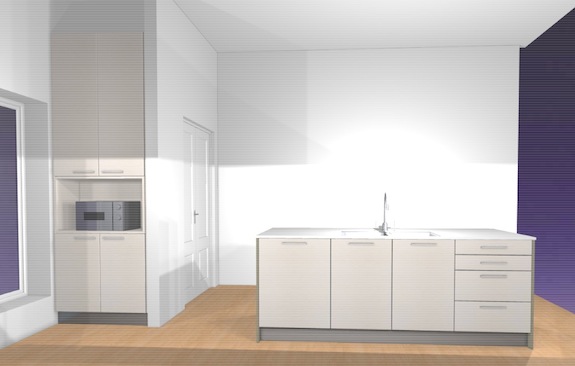
This last one shows how we’re hiding the microwave in a nook with additional cabinets. Up by the ceiling, above the cabinets, will be the A/C. We’re going with a “mini-spit ductless” system and that location gives us a nice place to hide the unit. (Not going with concealed units is another budgetary concession). The large wall will be exposed brick, so while the cabinets will be white / off-white, there will be plenty of color and warmth in the kitchen.
The other thing I’ve realized looking at these renderings is that the radiator we were going to put under the window will conflict with opening the cabinets. Dan and I are debating where the radiator should go.
So we’re crossing our fingers hoping we can get the Eggersmann kitchen. It’ll be really wonderful. Their sense of design is really special and their fit and finish is incredible.
