We’ve been going around and around trying to figure out the best design for the kitchens…
Our Kitchen
Initially we wanted an Eggersmann kitchen for ourselves and Eggersmann came up with an initial design for us…
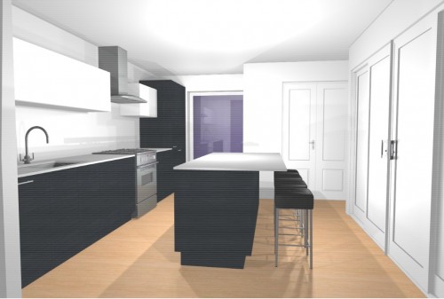
The black cabinets would have been made out of this wonderful laminate that had this cool texture and a hint of brown in the black – it would have been very sexy…
When that was too expensive they proposed a less expensive compromise design with mostly white laminate (which sounds boring, but is beautiful when they do it…)
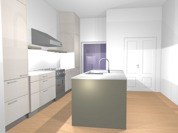 Then came the budget cuts to get everything in on budget. We put our discretionary money towards things that are hard to redo later – stairs, windows, etc. The kitchen (we still want) got cut and so now we’re getting an Ikea kitchen.
Ikea kitchens can be fine – in fact they can be beautiful. Ontario designer Carol Reed does some great stuff with Ikea cabinets – and she even references Margot Austin’s country house kitchen – a good friend of Dan’s from university days. Thing is, it’s hard to get the look we want – you sorta have to start with what you can do with Ikea and find a look that’s you’re OK with – they just aren’t as flexible or have as many options as a European modular kitchen like Eggersmann – at least not in the US (Ikea’s offerings in Europe are apparently much better). We don’t want someone to walk in and think “Ikea kitchen”.
At first we thought we would get Ikea’s Nexus birch cabinets and dress them up with a stainless counter. In theory that should look great, but when we see the birch cabinets in person we keep not liking them… Then I thought maybe we’d do white laminate or lacquer cabinets – Ikea has three levels of finish. The “best” one (Abstrakt) looks cool, but it’s a bit too glossy and cold for my taste, the chepest (Härlig) is well, cheap. And we’re not too fond of the middle one either (Appläd) – it just doesn’t look like a quality cabinet – it looks inexpensive which is not the first thing we want people to think when they walk in our house.
There are a few remaining contenders. One is Ikea’s Abstrakt glossy dark gray lacquer with black counter tops – like this display kitchen…
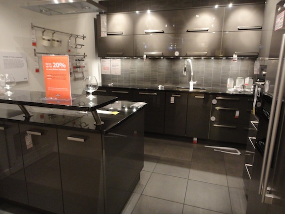 The more I look at that kitchen, the more I like it. Basically we’d be going pretty dark with the kitchen as a whole. The floors will be a fairly light colored white oak – basically they’ll have the color of unfinished wood – maybe slightly whiter. The darkness should work with the dark color of the window and french entry doors.
Our other top contender is Ikea’s Ramsjö “black brown” cabinets – in which case we’ll really embrace darkness. We don’t like the black-brown in the contemporary flat panels (Nexus), but with a traditional framed doors it looks pretty good… Here’s a bit of an over-the-top kitchen Ikea mocked up with the Ramsjö black-brown cabinets…
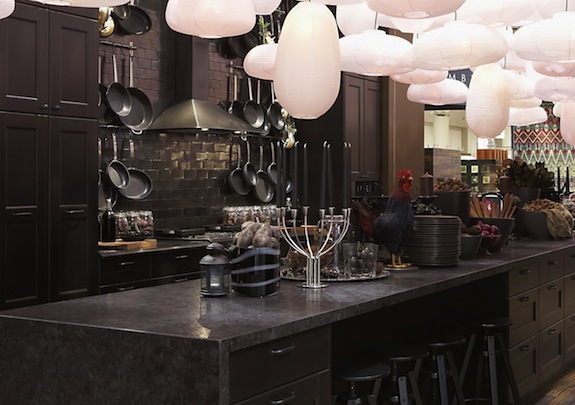 The traditional paneled doors would give a more traditional/transitional feel to the space which would be in contrast to the rather modern aesthetic we’re going for generally – but it could work – after all we have dark colored paneled french entry doors in the kitchen.
Dan’s current thinking is to get very shiny nearly-black tile that will reflect a lot of light – sort of like the tile in the picture only darker. His inspiration is the shiny black tile corridors in the Ministry of Magic in Harry Potter…
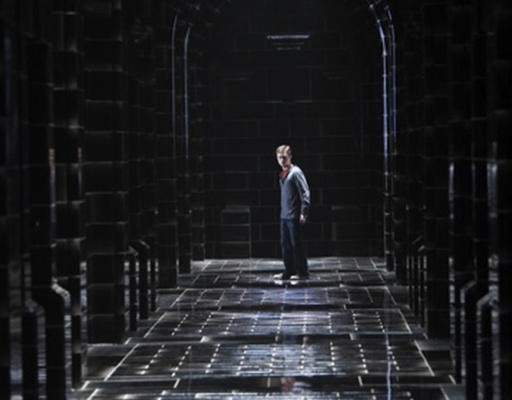 The general issue with going dark is that the kitchen is right next to the staircase which is a major white element. The stairs will have white steel and white Plexi sides. The only color is the stair treads which will be the same light colored white oak we have on all the floors. Having something so dark next to something so white may be a problem. Perhaps we can bring in white by doing counters that look like marble (actual marble would be impossible to maintain).
Or we could go with a white kitchen (wood, not laminate/lacquer). The black-brown Ramsjö cabinets in the picture above also come in a white, but the white is slightly pink since it’s a white glaze over birch. We’re not sure we like the pinky nature of the color. They have other white cabinets (Ädel) that are a truer white, but they don’t use solid wood for the cabinet frames. Plus, with white we worry we’ll have too much white everywhere given how white the staircase will be…
One thing we have settled on is the layout of the kitchen. We went through a number of iterations, but we’re settling on this layout…
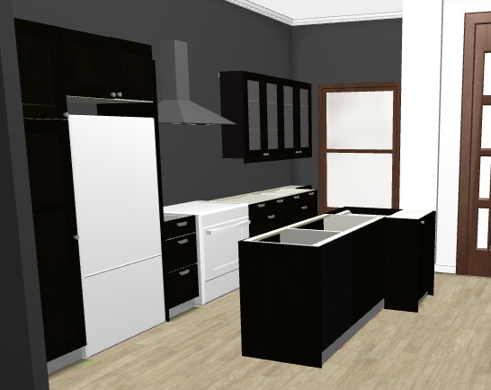 That will be an island with a sink, and the appliances will be stainless. While we’d love Sub Zero/Wolf like we had last time, we’ll be getting Electrolux fridge/range to help with the budget. If we go with the glossy gray cabinets, the wall-hung cabinets will be double decked horizontal cabinets – sorta like in the gray demo kitchen picture.
Two weeks ago we went to Ikea in Elizabeth. Last week we went to Ikea in Paramus, and tomorrow we’ll go to Ikea in Brooklyn. Hopefully we’ll see something that will help us make up our minds.
The Rental Kitchen
In addition to the Eggersmann kitchen for us, we initially wanted this honey brown (Nexus?) kitchen we saw at Ikea for the rental. It looked great and we thought tenants would like it…
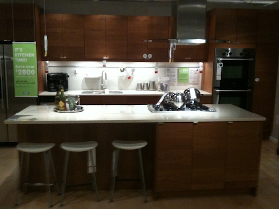 In terms of layout we are still going to do something very close to that… The location of the fridge and oven will be swapped and the space between them will be much smaller than in the demo kitchen, but otherwise the layout is almost identical – it’s just their island will be a peninsula in our rental kitchen. Here’s our current/final design – I think you can see how similar it is to the demo kitchen…
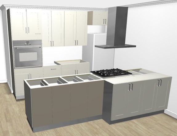
The renter will be able to sit a couple people at the peninsula which could substitute for a dining room table if they want to dedicate more space to the living room.
Problem is, Ikea discontinued the honey brown finish we wanted. While we had the layout set, we had to pick another cabinet finish. The rental kitchen/dining/living room is the darkest room in our house. One of the front “windows” (actually doors) brings in almost no light since it’s under the stoop, and the other is shaded from the morning light by the stoop – and the room is rather deep so not much natural light gets back to the kitchen. I thought maybe we should embrace the darkness and go with the Ramsjö black-brown, but Dan nixed that idea.
Instead we’re going to offset the darkness by going bright white… We’ll be doing the Ädel kitchen in the rental – a bit like this, but with different uppers…
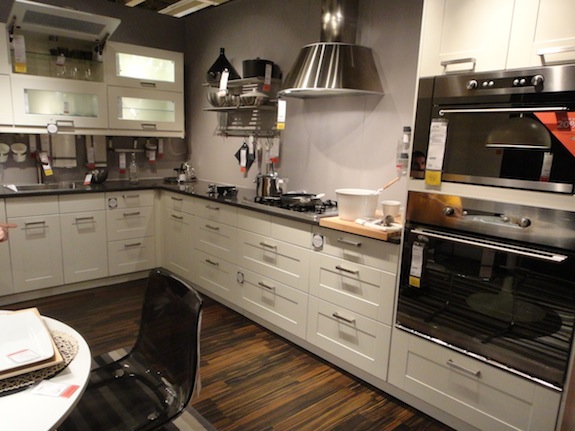 It’s a pretty neutral kitchen and should have broad appeal with renters. It’s a bit modern, but also pretty traditional.
Wrap-Up
Honestly, I just want to make a decision on our kitchen and move forward – but I keep vacillating between the different options. Ikea’s limited selection is bugging me a bit.
The upside is that Ikea’s having a 20% off sale on kitchens – that will save us quite a bit of money, which is helpful.
One other thing I should mention is that you can buy your cabinet boxes from Ikea and your cabinet fronts from a place like SemiHandMadeDoors.com (based in LA). We got quotes from them and from another place, but they cost more than we wanted to pay (rift-sawn walnut laminate was about 5 times the cost of Ikea’s Nexus birch not counting the 20% off Ikea’s offering now). If we’re going to pay good money for a kitchen we’d rather wait pay even more and get Eggersmann. If SemiHandMade had been just a little more we would have gone with them…
UPDATE
We went to Ikea this past weekend and settled on the glossy gray cabinets. The black-brown would have been too big of a visual difference from our white staircase. The final design is roughly like this…
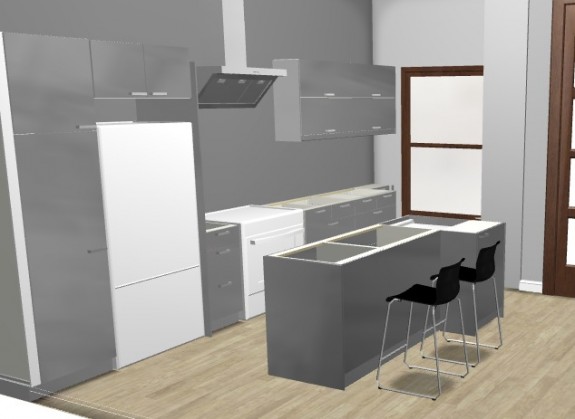 The extractor hood will be different, the fridge will be side-by-side and the colors aren’t exactly right, but that’s the general gist.

Hi Jay – love the discussion of kitchen options; super helpful – we’re going through the same process right now and also probably going to end up at Ikea for cost reasons. How did you get this great 3D layout, though? Is it a software program?
Cheers,
erin
Hey Jay,
Great post. Trying to remember the bid we did for you guys. Sorry we didn’t get the work, but it sounds like you guys have got a great kitchen coming. Looking forward to the pics!