Higher End Marble

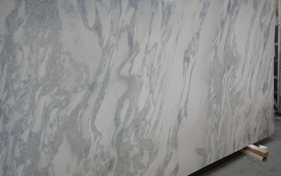
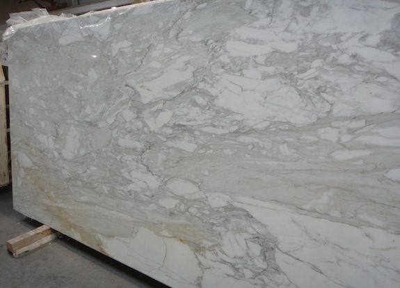
The Carrara counters we got were far from being super expensive – they’re pretty generic Carrara. If you’re wondering what else is out there that’s better, here’s a few pictures I snapped at HG Stone that show just how beautiful marble can be. If we had a high end European kitchen we might have shelled out the money for one of these…

There was a bluish slab with wavy veins…

bluish marble with wavy veins

And a gray marble with a golden vein running through it…

gray marble with gold veins

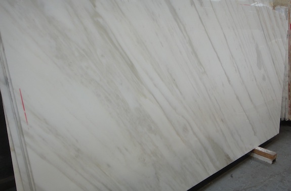
And then there was this light colored marble with golden veins – very pretty!

striated marble with gold veins

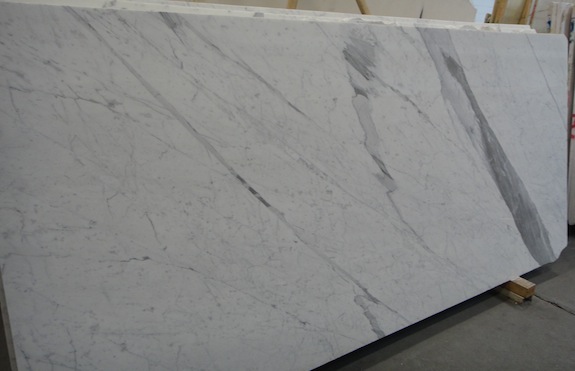
And then there was this light colored slab with a big dramatic gray vein running through it…

marble slab with a big, dramatic gray vein

And sometimes it’s not about linear veins at all – you get big round patterns in the marble…

marble with round circular patterns

By comparison, our Carrara slabs are rather humble. But they’re perfect for our purposes. 🙂

Picking Carrara Slabs For Kitchen Counter

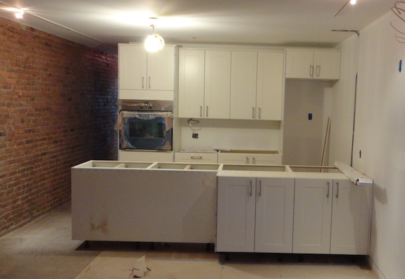
The last post was about the rental kitchen, but we’ve made progress on our kitchen as well. The cabinets are gray lacquer – Ikea’s Abstrakt Gray. Here’s a picture of the kitchen, but realize that most of the cabinets have a protective blue plastic on them. The only area in the picture that’s the correct color is to the left of the range, on the side of the fridge.
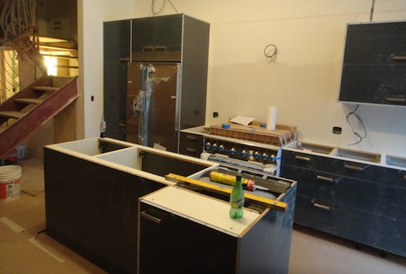
parlor kitchen cabinets

Picking a counter material was tough. Black counters look really good against the gray cabinets, but the stairs and the range hood we picked are all about white – black would have just been wrong. A color would have complicated the design, and a busy grain would have been distracting. So we settled on Carrara since we’re using it as a reoccurring material throughout the house.

The problem with Carrara is that most of the Carrara these days is really gray. And gray Carrara next to gray cabinets would just look muddled. At the same time it doesn’t make sense to spend the big bucks on primo Carrara to go along with Ikea cabinets. Ikea kitchens are decent these days, but not that good. So the challenge was to find Carrara that was at a reasonable price point but still pretty white. Luckily we found some at the second stone yard we went to – but just barely. A new shipment had come in and we picked it while it was still in the shipping container – there was just one block that looked right and we only saw about 18″ of it, but when we saw it two days later it was pretty close to what we were hoping for.

Our fabricator had to buy two slabs to do our kitchen since the slabs are smaller than the granite we bought for the rental. (This afternoon when we saw him he was grumbling a bit about the cost of the slabs). Here’s the one we’ll use for the island…
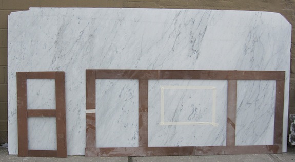
carrara slab for kitchen island

The template for the island is the big one to the right. The bottom is towards the door, and you can see where the sink will be on the other side. We are a little worried about the cantilever portion breaking since marble isn’t as strong as granite. Since marble is most likely to break along veins, we kept the heaviest area of veins over the dishwasher where the marble will be most supported. The veins are much less in the cantilevered area.

The little template to the left will be the piece that goes under the microwave in an area that’s not too visible.

We almost went with a stainless counter along the wall since stainless is a lot more practical than marble next to a cooktop. But I’m not a big fan of different counter surfaces in the same kitchen (in most cases). And a white counter will look better than a stainless counter, so we went with the Carrara. Plus stainless cost a bit more. This is the slab that will be used along the wall – on either side of the range…
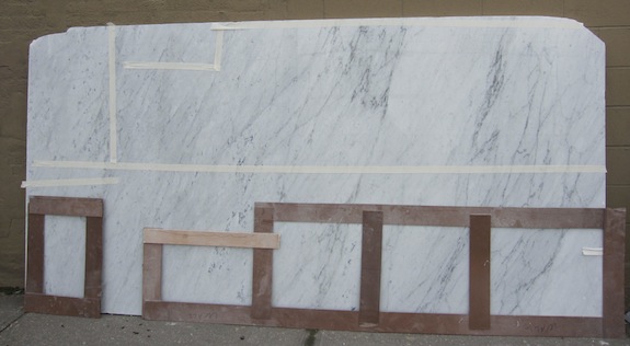
carrara slab for kitchen island

The two slabs are neighboring slices from the same block – so the veining is pretty much the same. But instead of using the bottom of the slab, like on the island, along the wall we’ll use the top part of the slab (where you see the tape). The big template will go to the right of the range, the little template will go to the left.

One other thing – 90% of the time people say Carrara in the kitchen should be honed, not polished. Apparently you can seal honed marble better than polished marble, and polished marble gets scratched up pretty easily in kitchens. But as Dan pointed out, honed marble next to high gloss cabinets would be a bit odd. Since the cabinets are high gloss, the marble needs to be polished (visually). We’ll just have to work harder to keep it looking good. And if we hate it, apparently wiping it down with vinegar and letting the vinegar sit for 20 minutes or so will dull the polish and make it look more or less honed.

Believe it or not, the fabricator is working over the weekend on the counters and they’ll be installed on Tuesday. It will be great to see that final piece really come together – the kitchens will look so complete.
Colonial Gold Won For Counter In Rental

[UPDATE: I’ve swapped out the pictures of the slab we got with a new better one that shows how the pieces will be cut…]

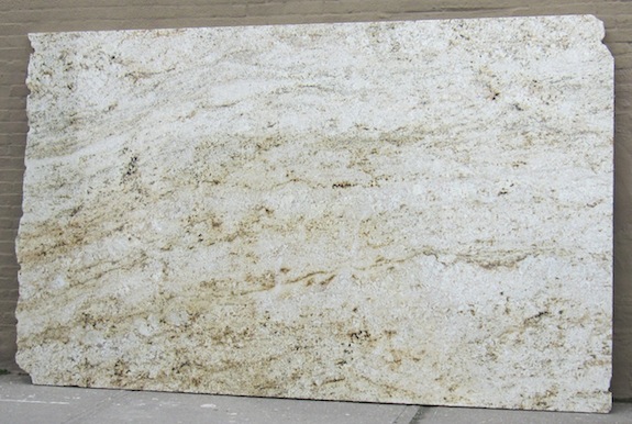
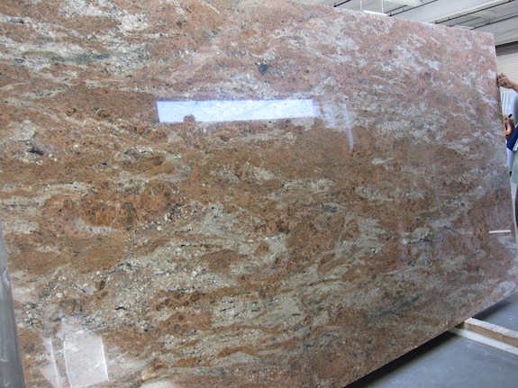
After my post the other day we decided against Rosewood granite for the rental – it just competed too much with the brick wall. Yesterday we went back to the stone yards and looked for other options. This time we took samples of the cabinets with us and it really helped. Some of the granite slabs just went better with the color of the cabinets. The one we chose was “Colonial Gold” granite.

On the slab below the peninsula will use the lower half of the slab. It’s reversed from the picture of the kitchen below… So the darker side will be next to the sheetrocked wall and the lighter side will be next to the hallway and brick wall.

granite slab for rental apartment

Since it’s a light colored granite, it’s going to be a pretty light/bright kitchen – almost white on white. The good part is the Colonial Gold won’t compete with the brick wall, but the dark bits are still strong enough to stand up to it (hopefully). Here’s the picture of the cabinets and and the wall again…

rental kitchen cabinets

There’s a slightly darker more yellow version of Colonial Gold called Colonial Creme. When we went to a different stone yard earlier in the morning they had slabs marked Colonial Creme that were as light or lighter than the Colonial Gold we bought – so the naming seems to depend on the source.

Here are few other slabs we saw that were either contenders or generally interesting. I gotta say, there’s so much cool granite out there – but of course there are a lot of factors that make each one best for a particular use…

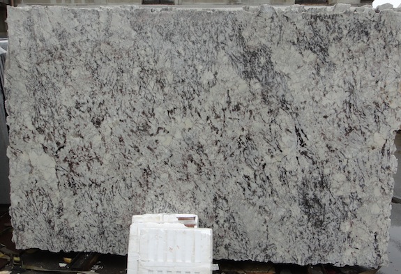
Here’s one Dan really liked and wanted to use in the rental kitchen. It’s cool, but I’m not sure if it would have been as successful as the Colonial Gold…

varigated granite

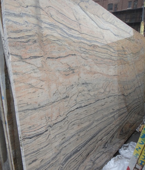
Here’s one that looks like wood – it would be pretty overpowering as a kitchen counter, but I think it would make a great coffee table…

wood like granite

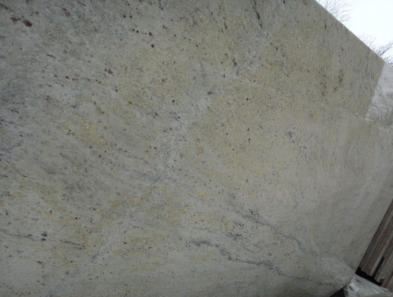
This was another that might have worked as the counter in the rental – light color with dark rust-like spots. But it didn’t work quite as well as the Colonial Gold.

granite with rust-like spots

Today we’re off to meet the architect at the house, then we’ll go see the stone fabricator and discuss cuts so we get the most interesting bits of the slabs in most visible location. Then after that it’s back to the house for a meeting with the ironworker about the rear deck/pergola.

Lots Of Choices Picking Countertops

A fair amount has gotten done since my last blog post, but once again some of it isn’t all that photogenic… We passed our plumbing inspection – so we can finally get water and gas working properly. They’ve continued working on the stairs. They’ve painted the bathrooms, but until the protective wrappings are off everything and the fixtures fully installed the pictures don’t make complete sense.

One thing we struggled with today was picking the countertops for the two kitchens. Our kitchen still has blue plastic wrap on most of the cabinets, so the color in the pictures is all off – so more on that later. But in the rental kitchen we first started with this demo kitchen being our concept…

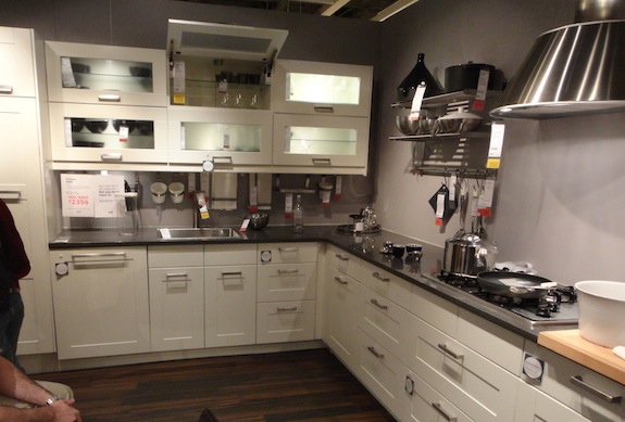
Ikea Adel white cabinets with dark gray counter

That’s Ikea’s Adel white with a dark gray counter. That was pretty much my vision of the kitchen color scheme complete with a Carrara backsplash. That counter isn’t quite as dark as you might think – here’s a close up picture…

dark gray counter

But then Dan didn’t want to go so dark since the room doesn’t have a whole lot of natural light. So he started thinking outside the box, but a light color counter with white cabinets would look anemic – there had to be some darkness to it. Dan also didn’t want anything too uniform in color. The stuff you get at places like Ikea & Home Depot is really uniform because they want the sample to match what you get. When you go with a stone that has more variation you sorta have to pick a particular slab – which the big stores can never accommodate.

Here’s the slab we found today that we liked – it’s rosewood granite…

rosewood granite slab

It’s got a lot going on and when we got home we seriously started double guessing our choice. Was it too pink? Was it too busy? It didn’t look contemporary enough. And so on… But what got us back to thinking it was a good choice was looking at a picture of the kitchen…

rental kitchen cabinets

The biggest issue is the brick wall. It’s got pinks and oranges in it like the slab. And as I looked at the picture of the kitchen, while an almost black might work, a more medium gray just seemed wrong given the color of the wall.

I’m still not 100% convinced, so we’ll see… I think we’ll look a little more before making a final decision.

Our kitchen is a whole other story – but that’s for another day. The short version is that we’re going to go with polished Carrara marble counters with gray lacquer cabinets. Yes, most people say to do honed Carrara in kitchens, but Dan’s emphatic about polished. And we were thinking about just having Carrara on the island and having stainless along with wall, but I think ultimately it will look better with Carrara everywhere – even if it’s not quite as practical.

UPDATE #1:

We’re now thinking the rosewood granite isn’t right for the rental… We’ll go Friday morning to pick something else. I’ll update this post when we pick the new slab…

Progress On Parquet Floor & Stairs

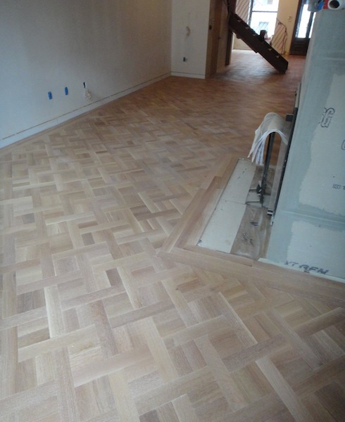
Our contractor has been making progress on a few things the past week. The parlor floor was sanded, and stained with 5% white Monocoat – it will get the first two coats of sealer tomorrow.

living room parquet

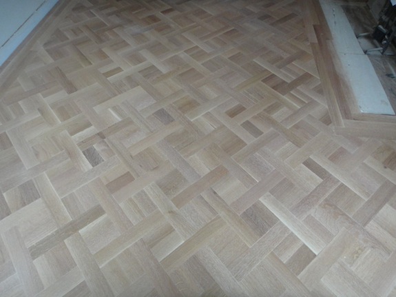
We went with a basket weave sort of pattern in the living room and dining room. It’s a pattern I found by surfing the Internet – not sure what the proper name of it is…

basket weave parquet

We like it because it makes the room feel wider. We were afraid if we went with the standard linear pattern it would make the parlor floor feel like a bowling alley. We do have a standard linear pattern in the kitchen, but since it doesn’t go the whole way so it looks fine.

One thing that we have been a little ambivalent about is the color variation – we were expecting less variation. The 1930s apartments that we’ve been living in for 15 years now have pretty consistent floors – but the wood was higher quality back in the 1930s because it came from older trees. These days the engineered floors are so highly processed they have consistency of color, but “real wood” isn’t as high quality as it was back in the day. If I had it to do all over again I might get “clear grade” instead of “select grade” even if I had to go down to flat cut (from quarter/rift sawn) to get the better, more consistent grade of wood. We’ve also heard bleaching the floors can make the color more consistent – but we didn’t think seriously about that until after it was too late. Still, I think what we have is pretty good and it does seem more consistent once it’s sealed.

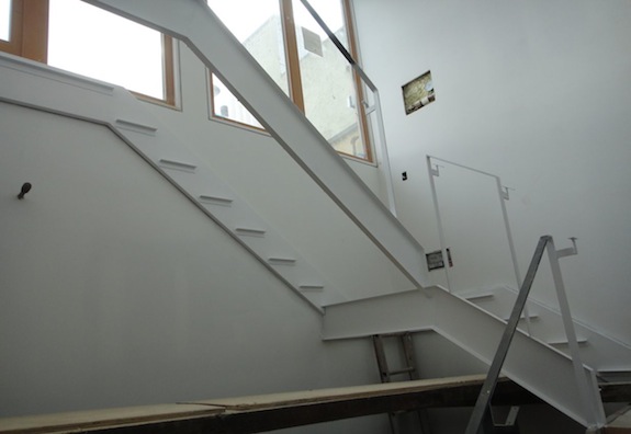
The other thing that’s progressing is the staircase in our unit. The top flight has been painted white…

white steel

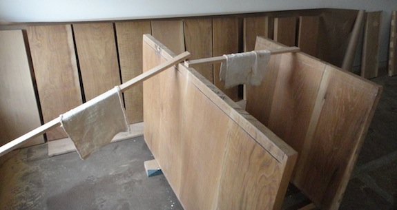
And they’ve been working on the treads. Quite a few of them have been stained and will be sealed soon…

stair treads stained

We’re going with flat cut on the top two flights of stairs and quarter/rift on the lower two flights. They’re starting from the top down, so what you see is the flat cut treads.

You can see some of the variation I’m talking about in those treads – there’s one against the wall and another in the second big panel that are pretty dark except a strip down the edge that’s quite light. They still look pretty cool though.. 🙂

The contractor has also started putting the kitchen cabinets together – seeing them go in is yet another thing that makes the house feel like it’s “getting there”. Pictures of that soon…